Profile
Profile: Data
Qualdo profiles data under different aspects and the results can be visualised under the different sections represented as different tabs in Profile -> Data page.
Relationship
Data relationship is a way to understand how the data are interconnected. Currently, attributes that are similar in nature will be auto-detected and shown on the visualization.
Cards
- The Flash Cards give the Data Quality views.
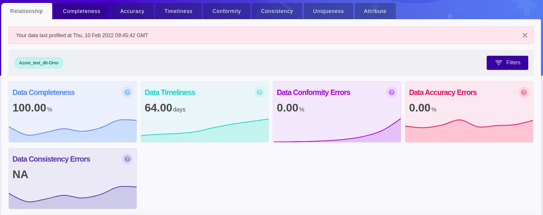
Data Completeness - This card shows the average fillrate of the individual attributes present in the selected Datasource by default or the individual attributes present as per the applied filters.
Data Accuracy Errors - This card shows the average data outliers detected on the attributes present in the selected Datasource by default or the attributes present as per the applied filters.
Data Timeliness - This card shows the average recency of the Datasets present in the selected Datasource by default or the individual attributes present as per the applied filters.
Data Conformity Errors - This card shows the average conformity errors detected on the applicable attributes present in the selected Datasource by default or the applicable attributes present as per the applied filters.
Data Consistency Errors - This card shows the average consistency errors detected on the applicable attributes present in the selected Datasource by default or the applicable attributes present as per the applied filters.
Visualization
- Visualization gives a quick peek of how attributes in different Datasources are related to each other.
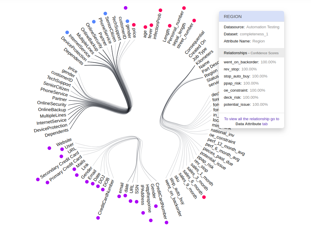
A relation is represented as a line connecting the related attributes.
Attributes are found on the circumference and each group of attributes belongs to a Dataset within the Datasource.
Hover over the attribute to understand about the other attributes they are related to and the confidence score of the relationships. It also shows you details about any errors detected in that attribute.
Different types of errors are represented in a different color next to the attribute and a legend is placed to guide you.
Error-values shown are always the latest errors found on the attributes for the selected time.
Visualization will change based on the applied filters.
Clicking on any attribute will take you to a detailed overview of the selected attribute.
Grid
A table view is to get quick access to the different Data Quality Metrics and their associated values for each attribute.
Completeness
Fillrate is a metric to understand how much Null/Empty/Invalid data present or not.
Cards
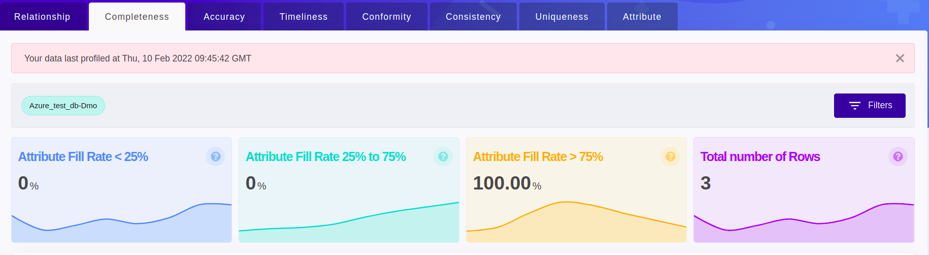
The Flash Cards give the overview of the percentage of attribute data contributing to different ranges of fillrate and the total number of rows present for the selected Datasource by default or as per the applied filters.
Visualization
Data completeness visualization gives an overview of the fillrate of the attribute(s) in the Datasource by default or based on the applied filters.
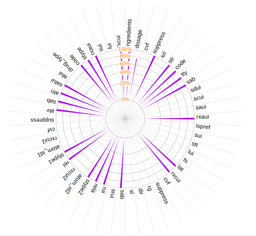
Attributes are on the circumference and each of the concentric circles represents a fillrate in percentage.
Each bar represents the fill rate for the attribute they correspond to and hover over the bar to find out the fill rate value.
Fillrate values shown are always the lowest fill rate for attributes in the selected period.
Visualization will change based on the applied filters.
Clicking on any attribute will take you to a detailed overview of the attribute.
Grid
A table view is to get quick access to the fillrates of attributes.
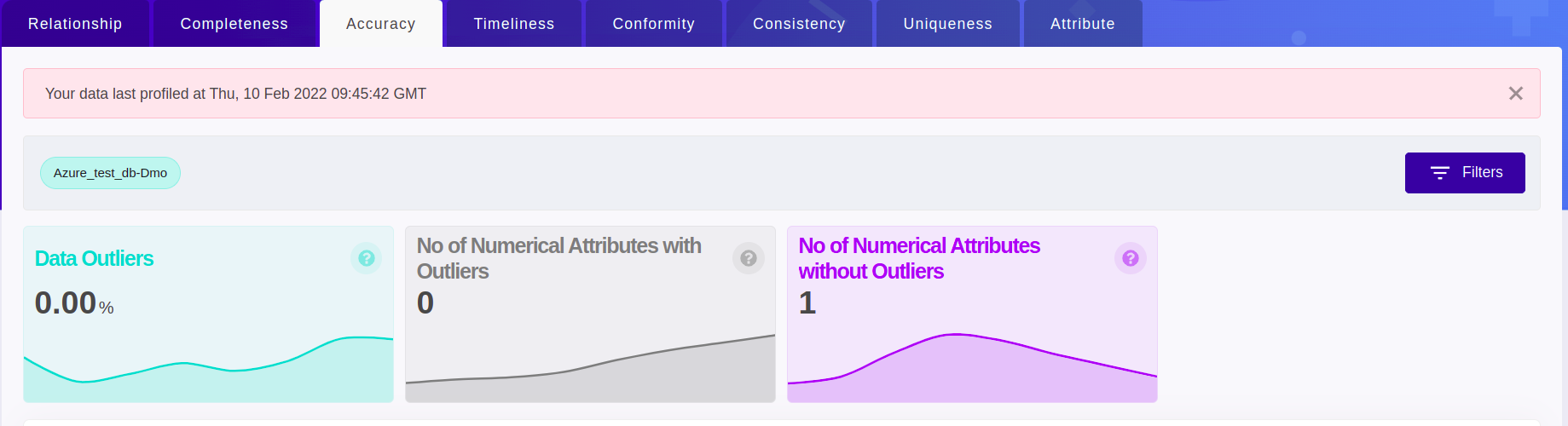
Data Accuracy
Data Outlier is a metric to understand how much outlier present in your data.
Cards
The Flash Cards give the overview of the percentage of outliers present in data and the number of numeric attributes with and without outliers.
Visualization
Data Accuracy visualization the different types of accuracy errors present in the configured data at a glimpse. Currently, data outlier is the supported metric.
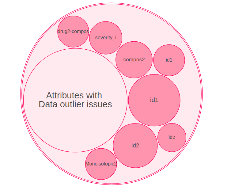
Every unique type of accuracy error is shown as separate circles. Data Outlier is represented as a single circle surrounded by attribute names found to contain outliers.
Higher the error values, the bigger will be the circle containing the metric name (Data outliers).
Hover over the circle containing the attribute name to find out the outlier value.
For the selected period, visualization always shows the maximum of the outlier errors that occurred per attribute.
Visualization will change based on the applied filters.
Clicking on any attribute will take you to a detailed overview of the attribute.
Grid
A table view is to get quick access to the data outlier of attributes.
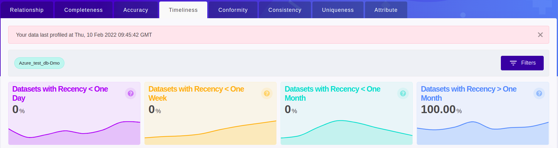
Data Timeliness
Recency is a metric to understand how latest the data is. Recency is measured in days.
Cards
The Flash Cards give the overview of the percentage of Dataset contributing to different ranges of recency for the selected Datasource by default or as per the applied filters.
Visualization
Visualization gives an overview of recency for the configured Datasets.
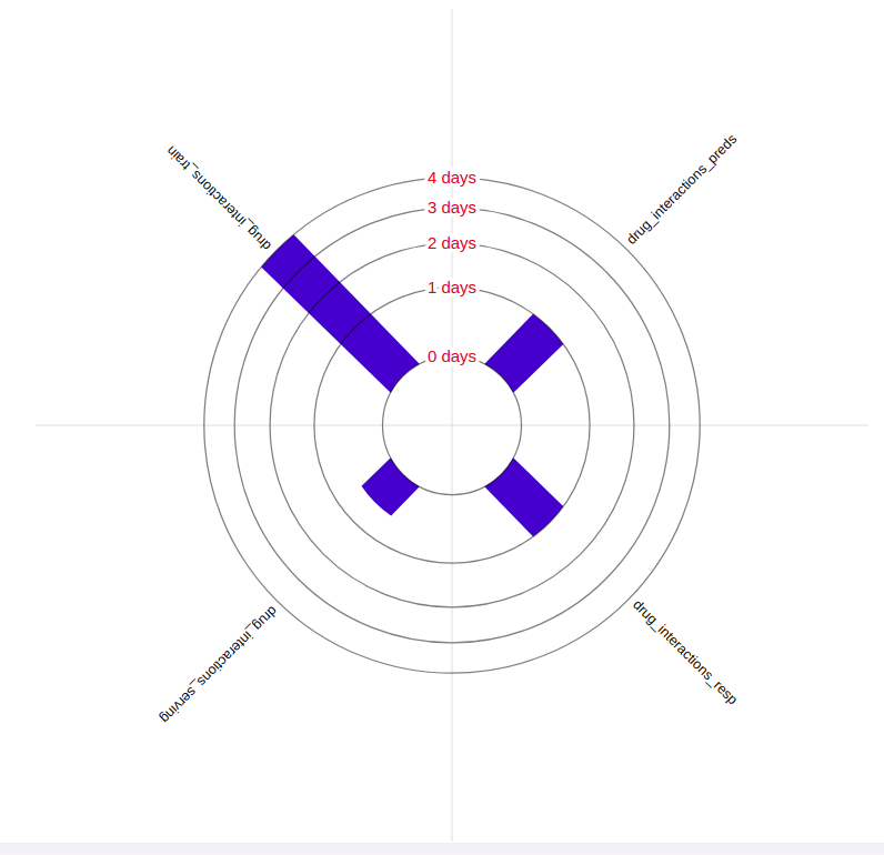
Datasets are on the circumference and each of the concentric circles represents different recency in days.
Each bar represents the recency of the Dataset they correspond to and hover over the bar to find the recency value.
For the selected time, the visualization shows the maximum recency value of a Dataset. (i.e) the longest duration in days for which the Dataset hasn’t been refreshed.
Visualization will change based on the applied filters.
Clicking on any attribute will take you to a detailed overview of the attribute.
Grid
A table view is to get quick access to the recency of the Datasets.
Conformity
Data conformity errors are metrics to identify data that don’t comply with certain standards.
Cards
The Flash Cards give the overview of different types of conformity errors that occurred.
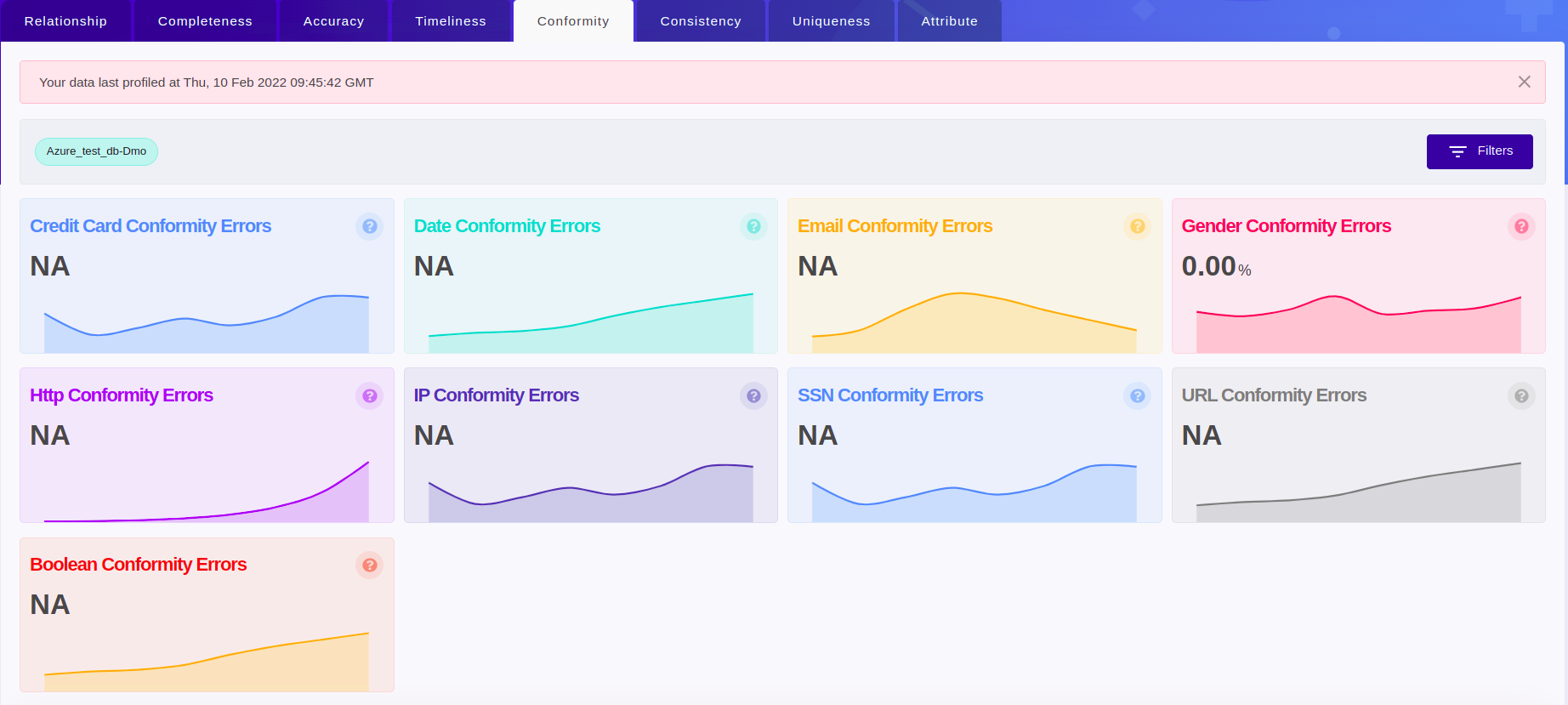
Credit card Conformity Errors - This card shows the average of the conformity errors on the attributes auto-detected as “credit card” in the selected Datasource by default or in the attributes present as per the applied filters.
Date Conformity Errors - This card shows the average of the conformity errors on the attributes auto-detected as “date” in the selected Datasource by default or the attributes present as per the applied filters.
Email Conformity Errors - This card shows the average of the conformity errors on the attributes auto-detected as “email” in the selected Datasource by default or the attributes present as per the applied filters.
Gender Conformity Errors - This card shows the average of the conformity errors on the attributes auto-detected as “gender” in the selected Datasource by default or in the attributes present as per the applied filters.
Http Conformity Errors - This card shows the average of the conformity errors on the attributes auto-detected to contain “HTTP response” in the selected Datasource by default or in the attributes present as per the applied filters.
IP Conformity Errors - This card shows the average of the conformity errors on the attributes auto-detected as “IP” in the selected Datasource by default or the attributes present as per the applied filters.
SSN Conformity Errors - This card shows the average of the conformity errors on the attributes auto-detected as “SSN” in the selected Datasource by default or the attributes present as per the applied filters.
URL Conformity Errors - This card shows the average of the conformity errors on the attributes auto-detected as “URL” in the selected Datasource by default or the attributes present as per the applied filters.
Boolean Conformity Errors - This card shows the average of the conformity errors on the attributes auto-detected as “boolean” in the selected Datasource by default or the attributes present as per the applied filters.
Visualization
Data conformity visualization captures the different types of conformity errors present in the configured data at a glimpse.
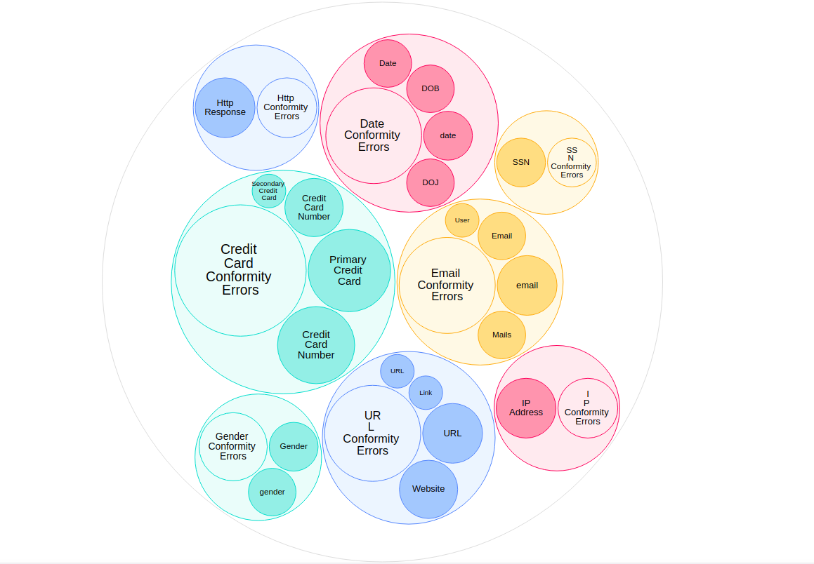
Every unique type of conformity error is shown as separate circles. Within the circle are attribute names found to contain errors and a single circle containing the conformity error name.
Higher the error values, the bigger will be the circle containing the conformity error name.
Hover over the circle containing the attribute name to find out the conformity error value.
For the selected period, visualization always shows the maximum of the conformity errors that occurred per attribute.
Visualization will change based on the applied filters.
Clicking on any attribute will take you to a detailed overview of the attribute.
Consistency
Data consistency errors are metrics to identify any consistency errors happening between two Datasets.
Cards
The Flash Cards give the overview of different types of consistency errors that occurred.
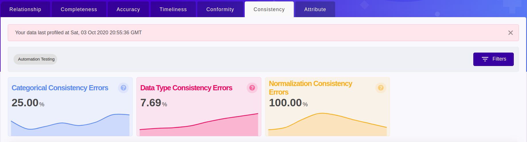
Categorical consistency Errors - This card shows the percentage of attributes with categorical consistency errors to the overall attributes qualified as “categorical” in the selected Datasource by default or the attributes present as per the applied filters.
Data Type Consistency Errors - This card shows the percentage of attributes with data type consistency errors (data type mismatch) to the overall attributes in the selected Datasource by default or the attributes present as per the applied filters.
Normalization Consistency Errors - This card shows the percentage of attributes with normalization consistency errors to the overall attributes qualified as “numerical” in the selected Datasource by default or the attributes present as per the applied filters.
Visualization
Visualization captures the data consistency issues in the Dataset being monitored in comparison with the reference Dataset provided.
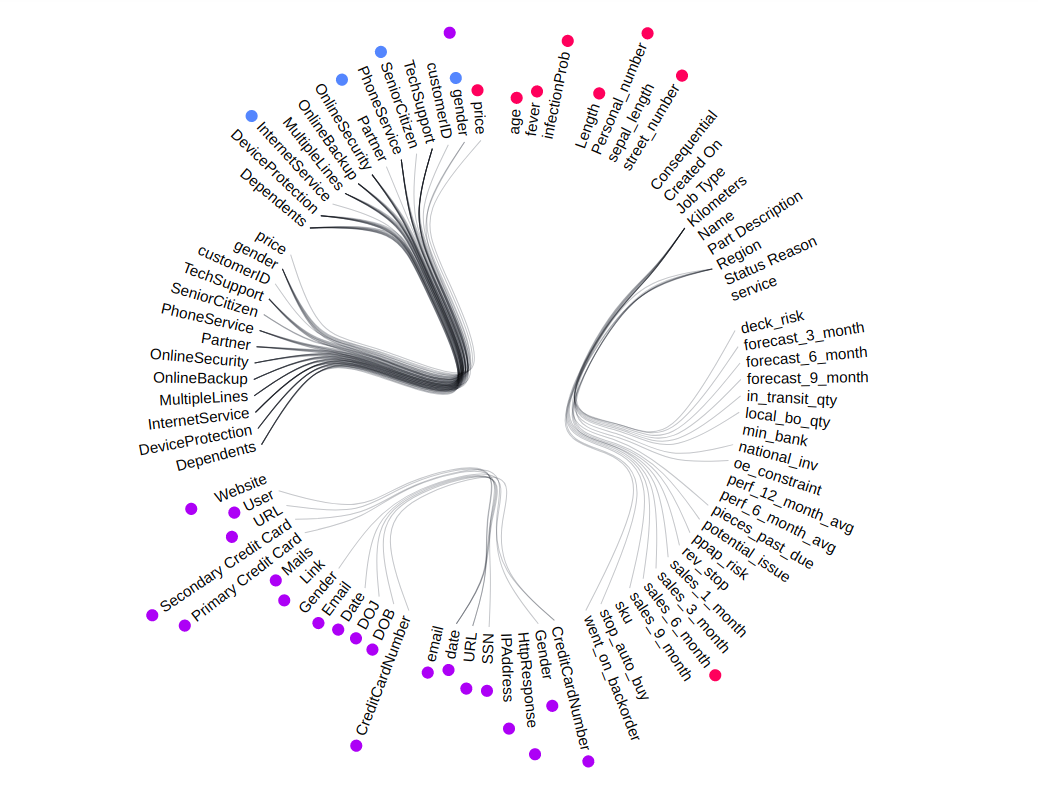
Attributes are found on the circumference and each group of attributes belongs to a Dataset within the Datasource.
Different types of consistency errors are represented in a different color next to the attribute and a legend is placed to guide you.
Hover over the attribute to find out the error values.
For the selected period, visualization always shows the maximum of the consistency errors that occurred per attribute.
Visualization will change based on the applied filters.
Clicking on any attribute will take you to a detailed overview of the attribute.
Grid
A table view is to get quick access to the different consistency errors in the data.
Uniqueness
Uniqueness is a metric to understand whether duplicates present in your data or not.
Cards
The Flash Cards give the overview of the number of datasets having the duplicate data.
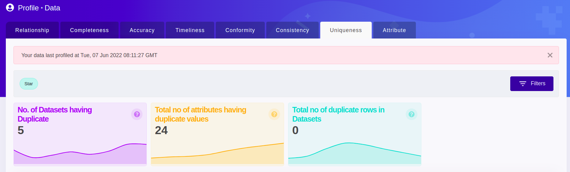
No. of Dataset with Duplicate - This card shows the count of datasets having duplicate rows in the selected data source by default or based on the applied filters.
Total no of attributes having duplicate values - This card shows the count of attributes having duplicate values in the selected data source by default or based on the applied filters.
Total no of duplicate rows in Datasets - This card shows the count of rows having duplicate values in the selected data source by default or based on the applied filters.
Visualization
Data uniqueness visualization gives an overview of the uniqueness of the attribute(s) in the datasource by default or based on the applied filters.
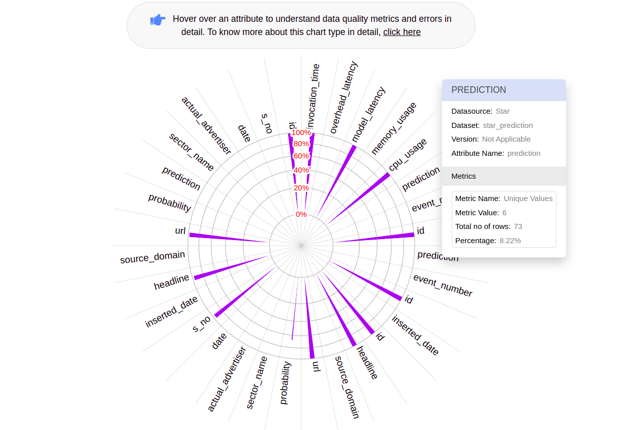
Attributes are on the circumference and each of the concentric circles represents a uniqueness in percentage.
Each bar represents the uniqueness for the attribute they correspond to and hover over the bar to find out the uniqueness percentage value.
Uniqueness values shown are always the lowest uniqueness for attributes in the selected period.
Visualization will change based on the applied filters.
Clicking on any attribute will take you to a detailed overview of the attribute.
Grid
A table view is to get quick access to the uniqueness of attributes.
Attribute
Attribute gives the detailed summary of the selected attribute
Cards
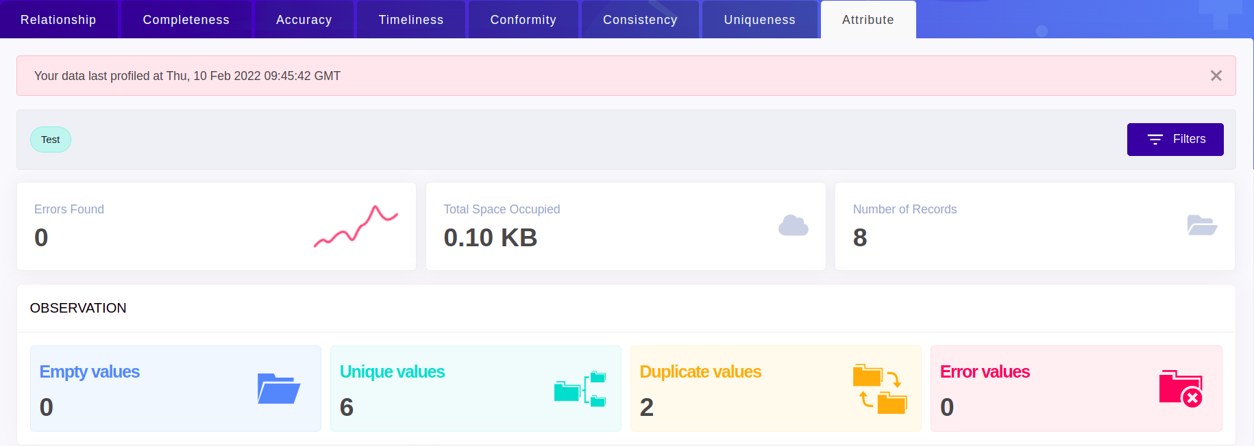
Empty data - The value on this card represents the count of empty rows for the selected attribute.
Unique data - The value on this card represents the count of unique values present in the selected attribute.
Duplicate data - The value on this card represents the count of duplicate values present in the selected attribute.
Error data - The value on this card represents the number of different types of Data Quality errors found in the selected attribute.
Attribute Drift
Attribute Drifts is a visualization on different types of drifts happening on the selected attribute.
Metrics drop down - Gives a view of drift on the values of attribute over time, drift on the applicable metrics on the attribute
Aggregate drop down - Gives a view of drifts happening on the statistical measures of the attribute. Statistical measures are applied only on the numeric types.